Home
Tripsplits


UI/UX & Product Design
3 months
Booking Platform
Mobile App




The Design
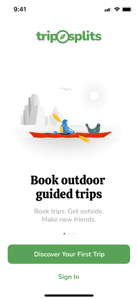
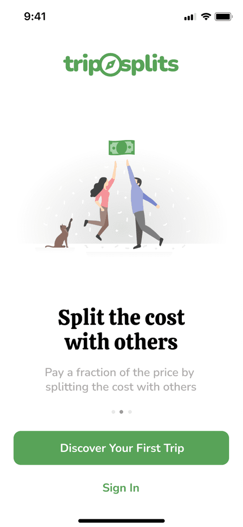
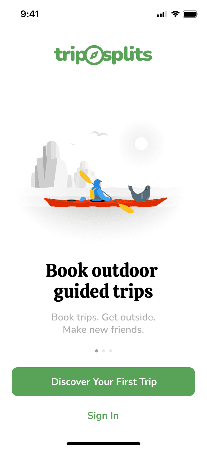
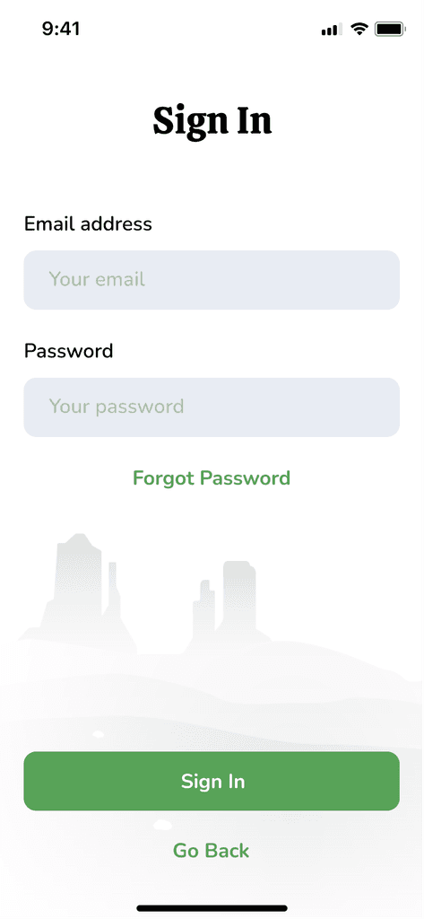
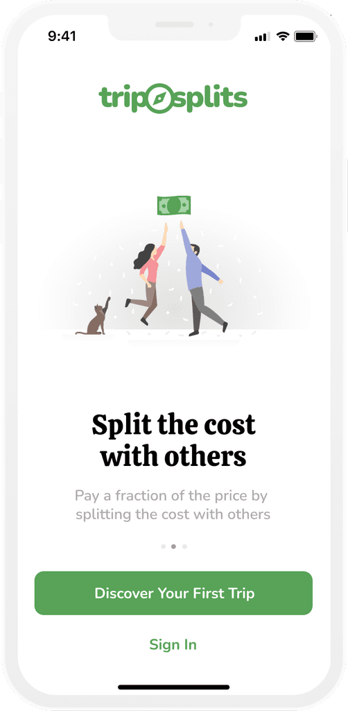
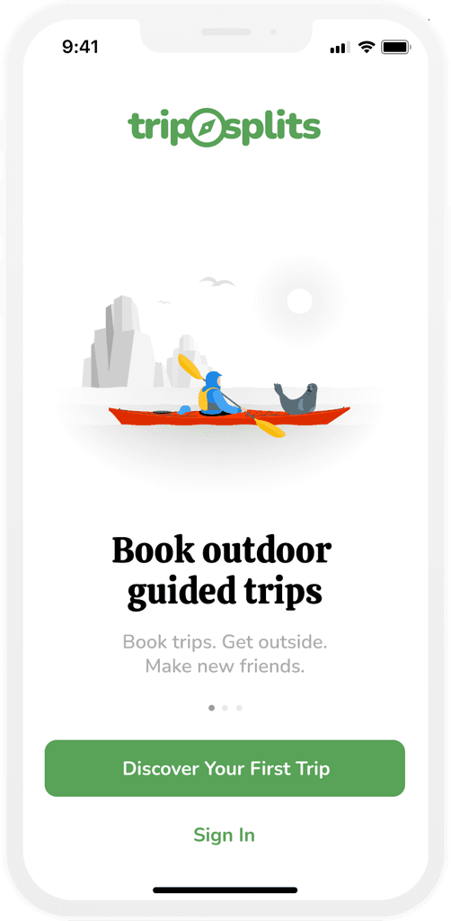
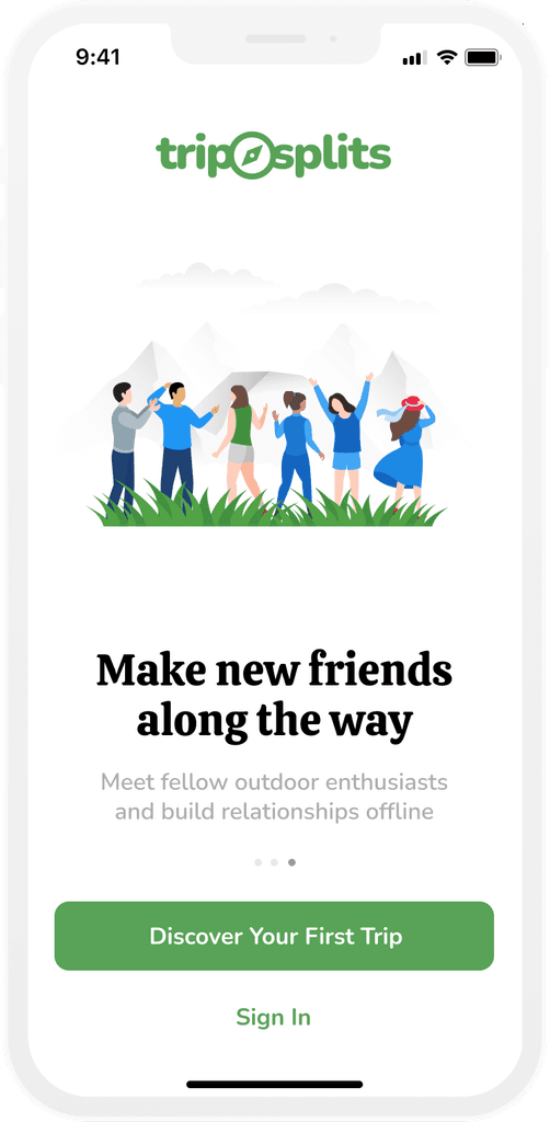
In constructing the first screens of the TripSplits app, it was important to consider the first time user. We wanted to respect the fact that TripSplits would be a novel concept for them and so we decided to introduce them to the app with several discovery screens.


Designing the Logo
When designing the logo I was considering the two unique selling points of the app: One, you can book outdoor trips and two, users split the costs of those trips amongst each other.

Booking a Trip
At the core of Tripsplits is not only being able to search for and book an outdoor trip, but having the freedom to select the price you want to pay. Users can book the trip, guaranteeing themselves a seat or they can bid a lower price and be added as a waitlist and in the event the rest of the seats fill up they will be booked for the price they were willing to pay.
In order to design for this novel price selection, we decided to make use of a slider. When users slide to the right they can guarantee a trip booking and when they slide to the left they can put themselves on the standby list for the lower price. Green indicates a booking, and orange indicates a standby.

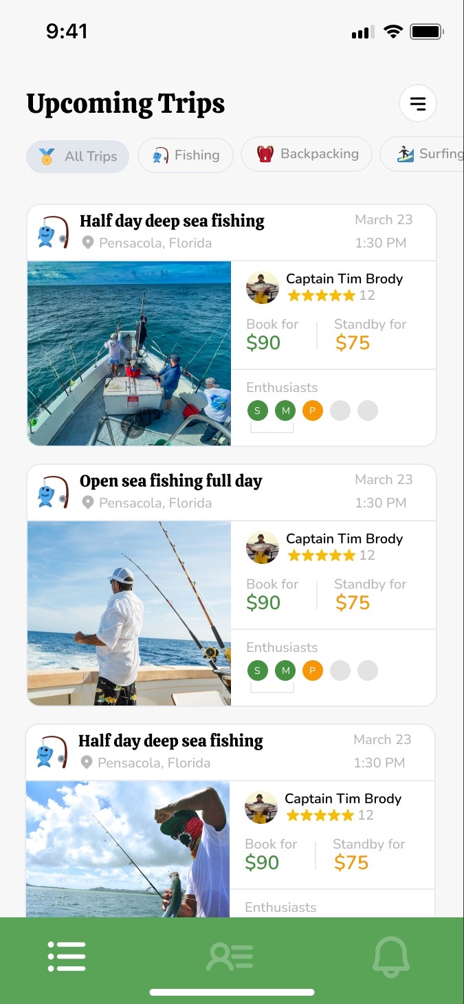
The Enthusiast's dashboard with trips available trips and navigation
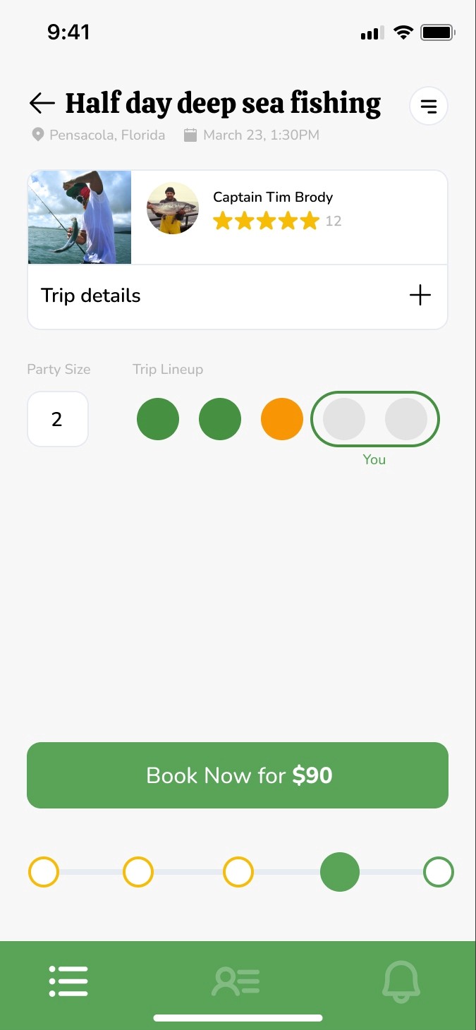
Trip details screen with slider to book trips or add self to the standby list


